
MATRIX TELECOM
MOBILE APP DESIGN
UI Design . Client Management
CLIENT
Matrix Cellular
INDUSTRY
TEAM
TOOLS
Telecom & Travel
Shachi Kaul (UI)
Arunesh Moudgil (UX)
Photoshop,
Invision, Axsure
PROJECT
OVERVIEW
Matrix is the leading provider of International Telecom Solutions to Indians travelling abroad. Its services include International SIM, Internet Packs for Smart phones, Laptops, iPad/Tablets, International Travel Insurance and Forex Cards. Matrix has been operational since 1995 through their website and phone call service and caters to a wide audience including leisure & business travellers. Following is the story of my contribution towards building an app that would become nucleus of the new positioning for Matrix as a travel companion.
UI LEAD
MY ROLE
Since we were on a very tight timeline of 10 weeks, during this project I was responsible for the UI design of the Matrix IOS app and for guiding the development team on the implementation of design. Arunesh, who was the lead UX designer on this project worked in parallel to create wireframes, prototypes and conduct usability testing.
CHALLENGE
DESIGN IOS APP TO CHANGE BRAND POSITIONING
Matrix had been in the Indian market as the leader of international telecom solutions, although with competitors cropping up and increasing demand from Matrix users for better customer service, it compelled them to broaden
their horizon and break into the market as a travel expert/travel companion. Due to costs and time limitations, the user research and success metrics was provided to us by the stakeholders. It was our team’s responsibility to focus on research analysis, design concepts, wireframes, usability testing and the user Interface Design. Thus, our challenge was to use the research provided by the Matrix group as the basis and design an IOS app in a span of 10 weeks which would change their market positioning from an international sim provider to a travel solutions company. Getting users to download the app and keeping them engaged on a regular basis was another important challenge that we had to overcome. We were also told that the travel concierge model may not be available for phase 1, due to a limited set of offers and coverage in cities. Hence, we had to make sure that we design for all possible scenarios. On the technical front, we saw getting the right balance between using services like geo-location and battery life as an important constraint.
We were also told that the travel concierge model may not be available for phase 1, due to
a limited set of offers and coverage in cities. Hence, we had to make sure that we design for all possible scenarios.
APPROACH
WATERFALL MANAGEMENT
Since this was a 10 week long project with a lot of stakeholders involved at different levels, we opted for the waterfall management approach which emphasised product development in a highly structured and linear way. This approach helped us in having the entire scope in place early on and finishing the project on time.
The design would start with a stakeholder workshop, high-level research and synthesis, concepts, moving to low-fidelity sketches and finally to visual design compositions for every screen. There would be quick iterations on each task flow with the stakeholders. The visual prototype would be informally validated with actual or pseudo-users at key points during the design process. After the completion of design, we would continue to support the development effort through assets production, quality checks, transitions feedback on builds and fine tuning the design deliverables.
THE DISCOVERY
FINDING THE SKELETONS - 2 DAY WORKSHOP
Arunesh and I started the project with a stakeholder UX workshop to understand the research already done on current users, understand our client’s vision, challenges and expectations. The workshop findings were translated into high-level expectations, persona, journey and success metrics document. Then the current demographic and usage data was reviewed to understand the detailed user behaviour. The workshop revealed the following key insights:
FACTS

-
Top selling product - calling and data plans. Other products-travel insurance,forex
-
Most of the travellers who buy matrix services travel to USA, UK and Australia
-
Most of the travellers are IOS users
-
Most travellers are on a business trip of 15-20 days
-
Most customer queries revolve around postpaid and pre-paid sim plans before the journey
-
Bill related queries are made post the journey
PAINS

-
Current website is confusing and doesn’t answer all the queries
-
No transparency on bill charges and data usage
-
Over 150 customer calls a day to customer service
-
Non availability of data and prepaid recharge during the trip
-
Calling and data plans are at reasonable prices which otherwise are very expensive.
GAINS

REQUIREMENTS
-
Matrix intents to evolve into a travel company by offering users a travel companion service through this app. This service will include destination specific offers, travel tips, ticket deals and discounts or offers ranging across hospitality, flights, car rentals, cab booking, restaurant discounts, and events.
-
Travellers should just download a single matrix app while traveling abroad, rather using a suite of country specific apps - Yelp, Uber, Weather, Currency exchange, hotels, etc.
-
The users should be able save some part of the amount being spent on Matrix services through the deals offered. This could become a key differentiator from other providers.
-
Matrix’s current communication medium with its customers is website and customer service through phone calls. The new App should reduce the need of customer care calls and make the company more responsive.
-
User should not lose data connectivity at any given time while travelling
-
Need one platform for easy access to information, to take quick actions and to make transactions while travelling outside

WHAT ELSE IS OUT THERE?
CLAY TELECOM
UNI CONNECT
-
Covers 200 countries
-
Very reliable
-
Clean User Interface
-
Limited services as compared to Matrix
-
No destination wise discounts on shoppings, events etc.
-
Can track usage only after generation of bill
-
Do not have a mobile app
-
Pay as you go, no bill generated
-
Transparent charging system
-
Offers country wise plans
-
Only gives prepaid sims
-
No destination wise dicounts on shoppings, events etc.
-
Meant for temporary relief
-
Covers few countries
PERSONA DEVELOPMENT
Key insights helped us in designating persona types. We used personas constantly throughout the project to guide design decisions, priorities, and create empathy amongst the client and our team. Our persona hypothesis consisted of three different archetypes (Business Traveller, Leisure Traveller, IT professional Offsite) which we used to facilitate discussions about our users needs, desires and varying contexts of use. Through careful analysis of our research, we identified sufficient behavioural variables to segment our user audience. These variables could be categorised into activities such as the reason of travel, duration of travel, new or returning user. We discussed the personas with our client to develop a clear picture of who the design of the app would target in the current phase.
Tertiary target will be CXO, IT people going onsite for a long period, and other management executives.

MAPPING THE JOURNEY
Once we were done defining the personas, we used journey mapping to visualise and communicate the users end‐to‐end experience across various touch‐points while making a journey abroad. This allowed us to represent user pain‐points and see where we needed to focus our attention. Mapping out the users emotions was key to setting client expectations about the aspirational emotional state we were aiming to design for. There are three parts to the user travel journey that the app needed to fulfil - planning for a trip, experience during the trip, and things to do after the trip.

DESIGN PITCH
THE PROBLEM
Our client, Matrix has a problem with its limited product offerings to its users. It also has a problem with the severe dependency on customer support for solving queries.
THE SOLUTION
Our idea to address this problem is to provide an IOS mobile app experience which would offer its customers the convenience of subscribing to their services, receive billing information, customer care and the ability to make transactions. More significantly, Matrix would evolve from being just an international sim provider into a travel company by offering users a travel companion service through this app. This service will include destination specific offers, travel tips, ticket deals and discounts or offers ranging across hospitality, flights, car rentals, cab booking, restaurant discounts, and events.
PRIMARY USER
The main groups of people who will benefit from our solution are families who travel abroad frequently as well as international business travellers.
PRIMARY BUSINESS GOAL
The primary business goal our solution addresses is to increase the number of matrix users and decrease the dependency on customer support.
PRIMARY USER GOAL SUPPORTED
The primary user goal our solution supports is convenience of travelling abroad.
Stakeholders will measure the success for phase 1 using the following criteria:
• Total number of downloads.
• Total number of service requests from the app.
• Reduction in call and volume for customer support.
• Number of offers availed during the trip.
MINIMUM VIABLE PRODUCT
By defining the exact problem we were able to identify the essentials that would help users to travel in a convenient and delightful way. The user journey helped us breakdown the tasks that are taken up by the user before, during and after the travel journey. This gave us a way to visualise what existing tasks would be useful, which one needed supporting, what opportunities were available to innovate and also what could be discarded from the existing model of providing Matrix services. This helped shape our user stories as well as minimum viable product offerings as seen below.

MUST
-
Get deals on restaurants, shopping, events
-
Book a cab, hotel and a restaurant
-
Buy one or more sim plans
-
Buy data plans
-
Buy Forex
-
Buy travel insurance
-
Track data & phone usage regularly
-
Recharge Sim
SHOULD
-
Clear Onboarding
-
Map view of shops, restaurants etc.
-
Detailed description of the deals offered
COULD

WON'T
-
Send a feedback
-
Rate the App
-
Know more about Matrix
-
Book flights
SETTING THE DESIGN DIRECTION
The concept was to turn Matrix, an international sim provider into a travel companion. Arunesh and I wanted the app to be extremely intuitive backed by users’ preferences, integrated apps, AI and robust backend technology. It was imperative that the app fulfils all the three scenarios-before, during and post the user’s journey. Apart from giving users an easy and simple way to book Matrix’s basic services, it was also essential to build an intuitive day itinerary for the user during the trip based on his/her location and other preferences. This would ensure that the Matrix app not only assists the user at every step throughout the trip, but it serves as a one stop shop for all travel requirements.
Even though the concept that we presented was appreciated by the stakeholders, however they weren’t too sure if they would be able to back up the intuitiveness of the app by backend technology and AI. Hence, we found a middle ground and decided to stick to offering deals and discounts to the user based on his/her location, while also enabling the user to book a restaurant, cab or a hotel.
We also decided to provide the users with some free data incase the internet data was over and they were unable to use the app while at a foreign location.
MIND MAPPING
Once the design direction was approved by the stakeholder, I took up the individual user stories to structure the content and build a mind map of the app.

DETAILED DESIGN
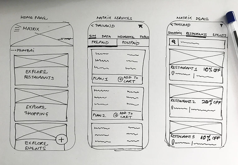
Once I was sure of the architecture of the content, Arunesh (my UX partner on this project) then started creating detailed wireframes for each of the user stories using Axsure. While he did that, I started working on the UI concepts for the mobile application.
I used material design to give each service being offered by Matrix a unique identity. I also used the card format for designing the UI to make the layout flexible. Each category of service was given a different colour and look. It was imperative that I make the complex calling and data plans extremely simple to understand and purchase. Since, the audience we were targeting were well travelled and informed, I wanted the app design to look premium, yet fun. I used illustrations in the background to give a unique look to the user interface.
ONBOARDING
-
The visual design of the app revolved around it looking premium yet youthful. We made sure that the onboarding emphasises not only on the services provided by Matrix, but also on the deals that the app has to offer.


